How I made my tea fly
Actually, it was not that difficult and just required a bit of planning, some knowledge of how to use layers in Photoshop, and a bit of compositing.
I have had this photo in my mind for a while, so the first thing I did was draw it roughly on paper. I will definitely not share that drawing with you, as I am sure that I am the only one that is able to understand my illegible scribbles.
Then I built the “set” which consists of two “walls” and a base. The base and back wall are two pieces of MDF board that I painted yellow The right-hand “wall” is yellow cardboard. I knew from my drawing roughly where each element should be, so I set it out that way. I then set my lighting up in such a way as to create the hard shadows on the right wall. I wanted the shadows to be the actual shadows and not fake photoshop shadows. I played around with the light until I thought the composition of the whole scene including the shadows looked pleasing. As my main light was coming from the left-hand side, I needed to make sure that the shadows being cast on the right wall did not overlap.
The image needed to be captured in a number of layers, as each element (especially the “flying” ones, needed at least two shots - one for each side). For the flying objects, I either handheld them for each shot or clamped them into place.
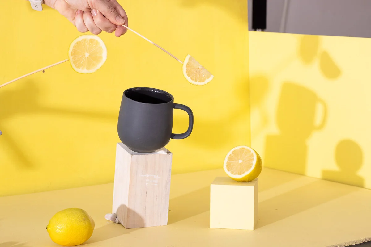
The images for the lemons
The images that make up the teaspoon (fresh yellow paint, still on my fingers)
The images that make up the honey
Only one image for the saucer, as I completely forgot to take the second image for the left side, so a bit of photoshoppery was required.
Some of the splash images
A clean background - not so clean as I only remembered to take it after the splashing was complete
I first tried creating the splash images with the teacup at the correct angle, but it was soon clear that the force of the fake ice cube dropping into the liquid would make the cup fall over. And as it was the only cup I had, I decided to place the cup upright and work the splash in photoshop, which wasn’t great as the cup and the splash were angled differently and do not look that convincing in the final image.
I then brought all the layers into photoshop and labeled them all clearly and started to mask in (or out) any parts that I wanted visible (or not visible)
The two images for the spoon and honey stick had to be aligned carefully and then composited together.
The saucer needed some work. When I was planning this image, in my mind the cup and saucer were matt. But I could not find a matt saucer. So I decided to use a white glossy one and change it in photoshop. I watched a couple of youtube videos on how to change white to black in photoshop. Along with the unconvincing splashes, the grey matt saucer (in my opinion) is the weakest part of this image. And I am in two minds whether I should change the saucer back to its original white glossiness.
I will not bore you with all the details on the masking of all the photoshop layers but if you are ever in my neck of the woods, I would love it if you popped in for a cuppa flying (or not) tea, or even coffee if you prefer.


